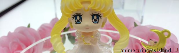
Make it bigger to fill the gaps, you lose the bottom and the top
Stretch it horizontally, it looks bad because it's out of proportion
No Olli, this is the best it gets without shrinking it so the black becomes more like a frame, and then giving it a cute, fitting background instead.